Vivavint: A UI/UX Case Study
Competitive Analysis: Vinted
Gathering Input
Vinted utilizes a typical sign up flow for gathering input. The emphasis is on signing up through Facebook, Google, or an Apple account. You can also use an email and password or skip this if you’re not ready to provide all of your information. Form Fields are used to gather the necessary information for sign up,

Navigation
There are a few navigation patterns within the Vinted app: The static Navigation Bar at the bottom with icons for Home, Search, Sell, Inbox, and Profile.
‘Shop by category’ provides us with Button Icons to narrow down to Women, Men, Kids, or Home.
‘Shop by brand’ reveals a Tag List of brands.
Within the ’Profile’ is Tab Navigation where the tab you are in is underlined in the app’s primary color.

Competitive Analysis: Vestiare
Social
Vestiaire utilizes a Newsfeed within the Navigation Bar. Here you are able to follow other sellers by clicking the ‘Follow’ CTA Button. You are able to see the other users’ profiles and items for sale.

Notifications
Within Vestiaire’s navigation there is a ‘Notifications’ section. This has a separate navigation pattern up top that includes tabs for All Notifications, My Messages, My Activity, My Community, and My Alerts. I find this to be an excessive amount of notifications because it is quite redundant in the information. I also couldn’t find how to send a message. You likely have to purchase or sell for this to be activated but maybe there should be information about that or not have this available until one of those actions has been completed.

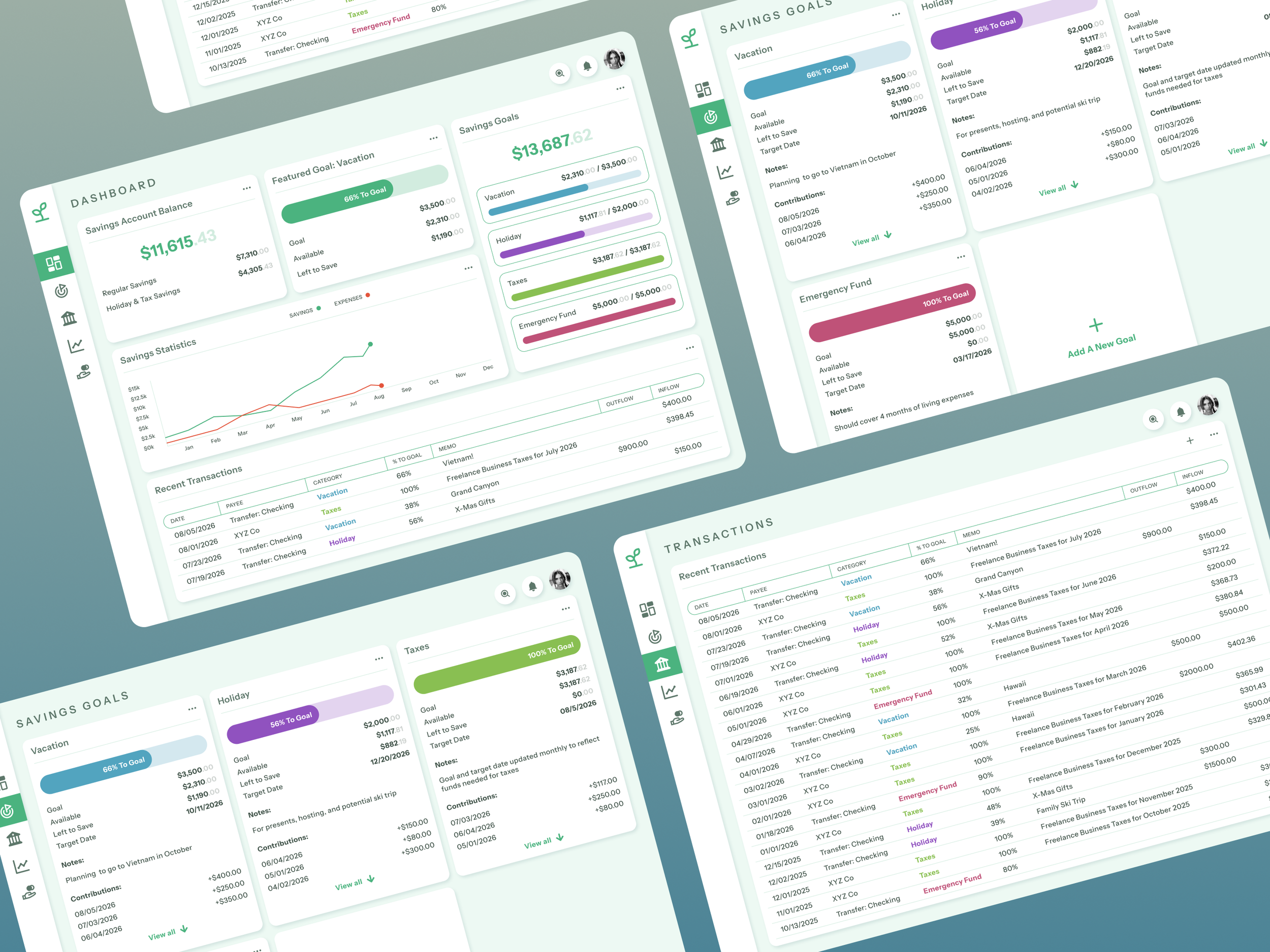
App Plan: Vivavint
Key Functionalities
• Create a profile
• Upload items to sell
• Leave reviews for other sellers
• Search items to shop
• Add to cart
Create a Profile
The simplest way to sign up is ideal but not everyone wants to create an entire profile at this point. There should be an option to do it upfront or later on within the ‘Profile’ section in the Navigation Bar. I like the way Vinted has a ‘Personalization’ section to adjust for categories, sizes, and brands.

Upload Items
Uploading items is one of the key functionalities in the app so it should be front and center. An Icon for ‘Sell’ as a prime option in the nav bar seems to be standard when looking at Vestiaire, Vinted, and OfferUp. (OfferUp calls it ‘Post’.) I think using a Step Progression pattern to upload an item is helpful.

Leave Reviews
I like how Amazon has card like sections for gathering input to leave a review. ‘Add a title’, ‘Add a photo or video’, and ‘Add a written review’ are all clear steps in the review process. When you click on the Camera+ area to add a photo or video a modal slides up into view asking to allow access to the camera or photos.

Search Items
Within the Vestiaire app there is a search bar for items and members. You can toggle between the two to find popular, recent or suggested searches. If you tap the magnifying glass icon a list of categories appears to direct you to exactly what you need.

Add to Cart
When adding an item to the Shopping Bag in the Vestiaire App you have to scroll down before CTA button ‘Add to bag’ appears. In the Vinted app I was surprised to see no shopping cart or bag. Instead they have a ‘Buy now’ button within the product page that takes you to immediate payment options. One less step in the buying process. I will have to think on this one.

Wireframes

UI Elements & Hierarchy


Moodboard

Text & Typography

Using Color
I decided to use color palette 1. I chose a triad of deep jewel tones to fit within the Art Deco style. These colors appear to be regal with the accent color representing gold. White and a light gray are used as background colors to keep the app clean looking.

The Final Product

Project Retrospective
How has your project met the objective of the original brief?
I designed the UI for the mobile version of a vintage clothing app. As per the brief this involved designing for key functionalities including creating a profile, uploading items to sell, and leaving reviews for other sellers. Other functionalities include product search, favorites, messages, and a shopping bag. I used appropriate mobile design patterns, a consistent grid system, and effective visual hierarchy. Deliverables included wireframes in low and mid fidelity and finalized high fidelity screens. I also designed a consistent set of icons, typography stylesheet, a visual inspiration board, and color palette.
Which task did you enjoy most?
I enjoyed searching for the best typography to fit the look and feel of the app. I love typography and I find it amazing that one letter or symbol can take on so many different forms and give a completely different vibe to the overall design. I found the font family ‘Laca’, which fulfilled my desire for a playful, yet luxurious feel. I also added ‘Laca Text’ for the smaller text styles for a clean and polished look.
Which task did you find most challenging?
The most challenging task for me was the initial app analysis research. It always feels as though you could never have enough research. I find that I spend a lot of time upfront brainstorming and doing research which slowed me down from working on some of the first few exercises. At some point you have to move on and start designing the product. The analysis itself was also time consuming because I signed up for quite a few apps and then had to go through their flows, document my findings, and take screenshots to compile into a plan for my own app.
Did you run into any roadblocks during the project?
How did you overcome them?
My biggest roadblock was me overthinking during my initial exercises. I was thinking about how I might present this work later on in a case study or presentation and was not focused as much on the exercise at hand. After realizing I had slowed down because of this I just started designing in Adobe XD to start creating something, even if it wasn’t for that particular task. I also reached out to my tutor and mentor who both helped guide me back into focus.
What are some key insights you can take away from each stage/deliverable of the project?
I realize it is better to iterate often and get feedback. It is important to try different solutions even if you know it’s the wrong one just to get it out and confirm it one way or another. Also, I am usually the type of person who doesn’t want to show my work until it is perfect. I have been getting over that desire for perfection through this project. Showing unfinished work to others to get more insight about the direction it should go is invaluable.
If you could do the project again, what would you do differently?
If I could do the project again I would probably choose to design the productivity app instead of the vintage clothing app. I have designed e-commerce experiences before so I should have tried something different. I would also be more mindful of keeping my file clean with naming and grouping objects. Learning more about components at the beginning would have been helpful when changing something that exists on several screens. For the next project I want to become faster with shortcuts in the tool I am using to design. I also might try to use Figma instead of Adobe XD.
Go to Next Project

Providence
An internal web portal